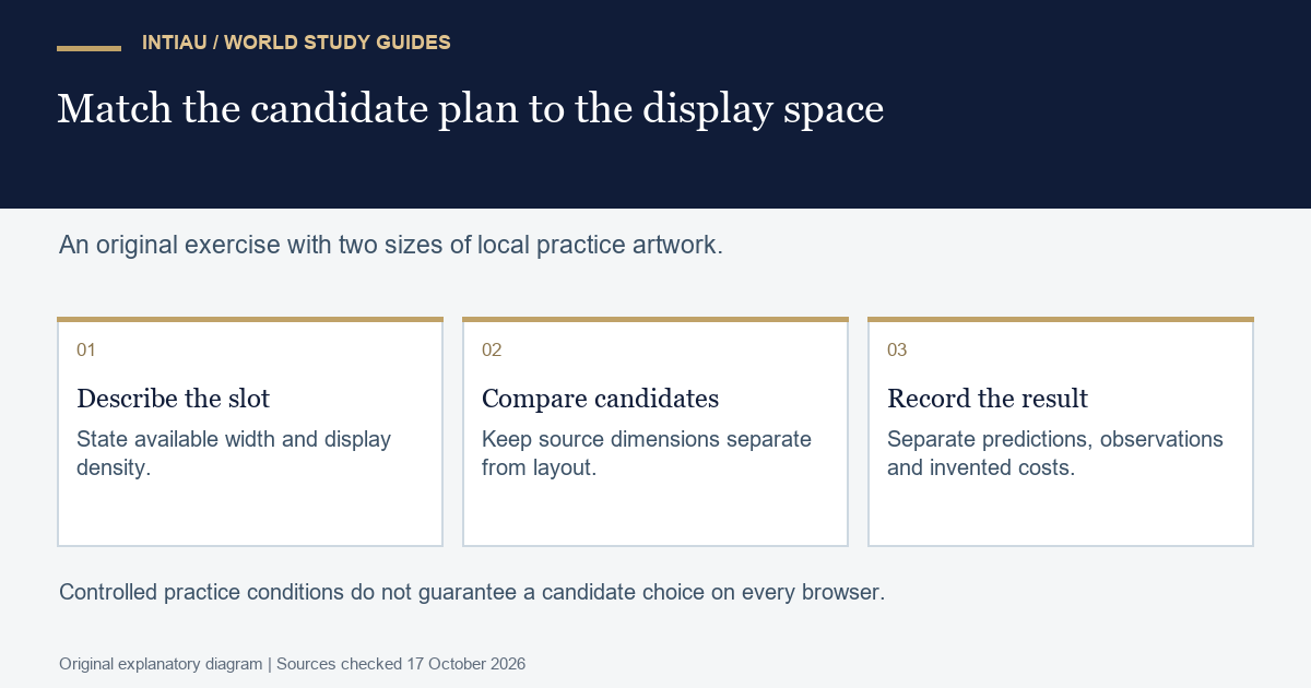
This self-study workshop plans image delivery for a fictional reading card. You will distinguish the size of an image file from the size of the space it fills, predict suitable candidates under stated conditions and check which candidate a fresh local fixture selects. The task uses original practice artwork, not photographs, logos or downloaded assets.
The MDN responsive-image guide explains width candidates in srcset and slot-size hints in sizes. Candidate choice can depend on display density and other browser conditions; a hint does not replace the actual layout.
Separate three quantities
The fictional artwork has a two-to-one aspect ratio. There are two candidate files, 400 pixels wide and 800 pixels wide. Our design displays the image at the available viewport width up to a maximum of 600 CSS pixels. For the paper calculation, assume no page padding, browser zoom at its ordinary setting and the display densities shown below.
| Slot width | Density | Target sample width | Suitable supplied candidate |
|---|---|---|---|
| 320 CSS pixels | 1 | 320 pixels | 400 pixels |
| 600 CSS pixels | 1 | 600 pixels | 800 pixels |
| 320 CSS pixels | 2 | 640 pixels | 800 pixels |
The target sample width in this exercise is the slot width multiplied by display density. It is not the image’s CSS width. At a 320-pixel slot, the displayed height should be 160 CSS pixels under the stipulated ratio, whether the selected candidate is 400 or 800 pixels wide.
Worked inert image fragment
The filenames below stand for two original local fixtures showing the same simple artwork. They are not links to resources supplied by this article. The stylesheet belongs only inside the learner’s isolated fixture, and all the example markup is displayed here as text.
<img class="reading-card"
  src="card-800.svg"
  srcset="card-400.svg 400w, card-800.svg 800w"
  sizes="(max-width: 600px) 100vw, 600px"
  width="800" height="400"
  alt="Original practice card with a central circle">
<style>
body { margin: 0; }
.reading-card { display: block; width: 100%; max-width: 600px; height: auto; }
</style>
The worked answer aligns the slot hint with the intended maximum width. A viewport of 800 pixels still produces a 600-pixel card. A hint of 800 pixels at that width would describe a different slot from the one our stylesheet creates. Keep the hint and the actual layout in the same planning sheet.
For the local check, record viewport width, display density, rendered width and height, and the selected source. Use a fresh isolated context for each condition so a previously selected resource is not mistaken for a new cold selection. Report the observation as a result of that fixture and browser, rather than asserting that every browser must make the same choice.
Work through the delivery trade-off
Suppose, only for a planning exercise, the smaller candidate costs twenty KiB and the larger costs fifty KiB. Serving the smaller one saves thirty KiB relative to the larger one. Across ten fictional card views with the smaller resource, the difference is 300 KiB. These supplied costs are invented; they are not measured sizes of the tiny fixture artwork.
The arithmetic alone does not settle the decision. If a condition needs a larger sample width, always forcing the smaller file may sacrifice the intended detail. Conversely, offering a large candidate does not prove it will improve a particular illustration. Compare the actual visual content and required reading detail alongside delivery cost.
A common mistake is to use width descriptors that do not match the real candidate files. Another is to copy the slot hint from a full-width layout after placing the image inside a narrow column. In either case, the planning data no longer describes the resources and space that the browser is using.
For a useful extension, change the maximum display width to 500 pixels. Update both the layout and its hint, then recompute the paper table before checking the altered fixture. At density one, a 500-pixel slot needs a target sample width of 500; the available candidate at or above that target is still 800. Changing the slot does not automatically create an intermediate source file.
Questions and evidence to retain
Submit the paper table, exact candidate dimensions, three controlled observations and a clear distinction between invented cost numbers and actual fixture measurements. This checks a delivery mechanism, not image quality across all devices or a production page’s complete load time.
Does the slot hint set the rendered CSS width?
No. It informs source selection; the layout determines the displayed space.
What is the target sample width for a 320-pixel slot at density two?
640 pixels in this paper calculation.
Are the twenty- and fifty-KiB costs measured fixture results?
No. They are explicit fictional planning inputs.
This is an original INTIAU editorial self-study activity; no qualification is awarded. See Courses or Contact for institutional information.
Related guides
View the study diagram