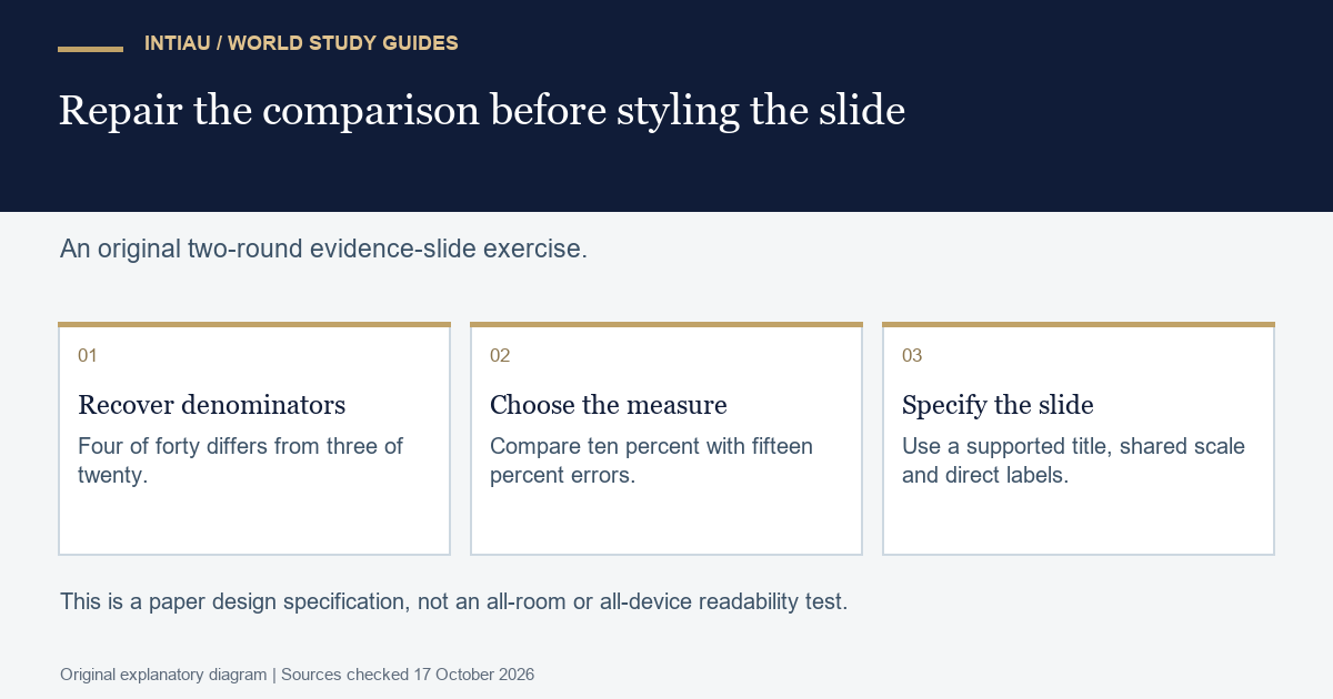
This self-study workshop redesigns a misleading evidence slide without opening presentation software. You will choose the correct comparison, retain denominators and write a title that follows from the data. The finished output is a complete paper slide specification and an audit of the claim a viewer is likely to take away.
Make the visual serve one supported message
The MIT AeroAstro guide to slide design recommends one main message per slide, supporting information aligned with that message and visual clarity suited to the audience. It also warns against distractions that compete with the intended reading of the evidence.
Our original fictional data concern errors in two model packing rounds. Round A has four errors in forty tasks. Round B has three errors in twenty tasks. A draft slide uses two enormous bars labelled 4 and 3 and the title “B is more accurate.” The slide also includes decorative parcel icons, a long equipment list and no task counts.
Check the comparison before redesigning it
| Round | Errors | Tasks | Error share | Correct tasks |
|---|---|---|---|---|
| A | 4 | 40 | 10 percent | 36 of 40 |
| B | 3 | 20 | 15 percent | 17 of 20 |
The raw error count is lower for B, but the task count is also lower. Four divided by forty is 0.10; three divided by twenty is 0.15. The observed error share is five percentage points higher in B. Neither round’s design or allocation is described, so this table supports a descriptive comparison rather than a causal explanation.
Write the complete slide specification
Use the title “A had a lower error share in these model rounds.” Under it, show two simple marks on the same zero-to-twenty-percent scale: A at ten percent and B at fifteen percent. Label them directly “A: 4 of 40” and “B: 3 of 20.” Put “Error share; lower is better in this task” beside the scale. Add a brief note: “Fictional model data; unequal task counts; no causal comparison.”
That is the complete worked slide plan. The scale, values, labels and boundary all have a specified place. It contains no decorative icon that could be mistaken for an additional data point. If you prefer a table-only slide, the four numerical columns above also support the message; a chart is not compulsory.
Do not crop the scale so that ten and fifteen appear to differ by an enormous visual distance. Do not label the comparison simply “accuracy” while plotting error share. A viewer should be able to identify the measure and its direction without hearing a rescue explanation from the speaker.
Plan the spoken explanation
A suitable speaker note is: “The first draft compared raw errors, but the rounds contained different numbers of tasks. After retaining those denominators, A has four errors in forty tasks, or ten percent, and B has three in twenty, or fifteen percent. A therefore has the lower observed error share in this model record. We do not know whether task difficulty or another condition differed, so the slide does not attribute the difference to a packing method.”
The note and title agree. A poor note would say “B is still better because three is smaller than four.” That repeats the original denominator error. A visually attractive slide cannot make an invalid comparison valid; the arithmetic and the wording must be repaired first.
Audit readability as a design requirement
On paper, sketch the title, scale, marks and direct labels using only the space you would actually have. Check whether each label can be read without a separate colour legend. Make the two rounds distinguishable by text as well as appearance. These are specifications to review, not claims that a particular font size has been tested in every room or on every device.
Score one point for the correct denominator-based measure, one for correct arithmetic, one for the evidence-led title, one for visible units and direct labels, and one for the scope note. The model earns five. Removing the note to enlarge a decorative image loses the scope point and does not improve the evidence.
Is three errors necessarily better than four?
Not without the task counts. Here, three of twenty is a larger error share than four of forty. The desired comparison determines which denominator must remain visible.
Must I build the chart in software?
No. A paper specification with the exact scale, marks and labels is the required output. The exercise involves no PowerPoint, Word or browser account.
Does the revised slide prove why the rounds differ?
No. It describes the supplied record. The scenario provides no allocation or difficulty information that would identify a cause.
This is original INTIAU editorial self-study practice; no qualification is awarded. Use Courses for study navigation and Contact for editorial enquiries.
Related guides
View the study diagram