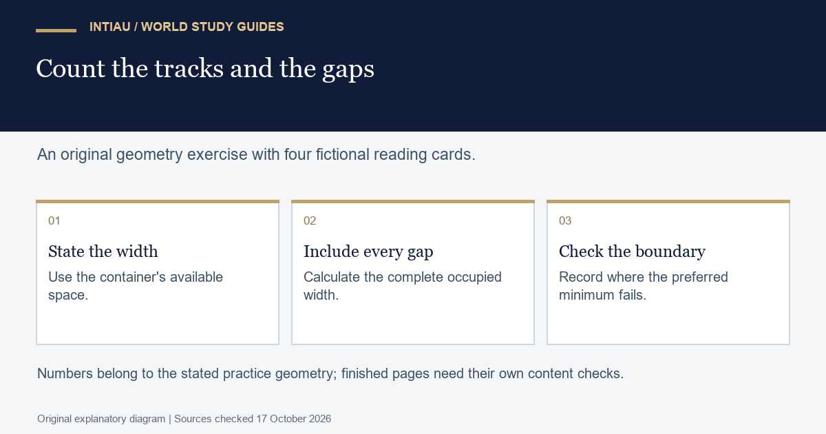
This self-study workshop lays out four fictional reading cards without choosing a separate fixed column count for every screen width. You will predict the columns that fit, inspect the resulting positions and explain a narrow-container failure. The useful output is a relationship between available space, minimum card width and gaps, rather than a collection of arbitrary breakpoints.
The MDN grid-column reference documents repeated tracks, the minmax() size range and fr shares of remaining space. Its syntax includes automatic repeated track lists.
Predict a layout with explicit assumptions
Use four cards named Atlas, Beacon, Compass and Delta. Their source order is fixed. For the first calculation, assume the grid’s content width is either 320 or 800 CSS pixels, the root font size is sixteen pixels, the gap is one rem and the minimum track is fourteen rem. No card has an unusually long unbreakable token.
| Available width | Candidate columns | Minimum required width | Answer |
|---|---|---|---|
| 320 pixels | Two | 224 + 16 + 224 = 464 | Does not fit |
| 320 pixels | One | 224 | Fits |
| 800 pixels | Three | 3 × 224 + 2 × 16 = 704 | Fits |
| 800 pixels | Four | 4 × 224 + 3 × 16 = 944 | Does not fit |
The predicted layout therefore has one column at 320 and three at 800. With three columns, the fourth card starts the second row. At 800, the two gaps consume 32 pixels, leaving 768 for tracks; each track receives 256 pixels. These results depend on the stated content width and font-size assumptions, not simply the outer browser width.
Worked fragment and interpretation
The markup and CSS below are inert learning text. Apply the stylesheet only inside an isolated local fixture. The card names are intentionally short so the first experiment isolates track sizing instead of word-breaking behaviour.
<div class="cards">
  <div>Atlas</div>
  <div>Beacon</div>
  <div>Compass</div>
  <div>Delta</div>
</div>
<style>
.cards {
  display: grid;
  gap: 1rem;
  grid-template-columns: repeat(auto-fit, minmax(14rem, 1fr));
}
</style>
The complete answer should report both positions and widths. At the wider size, Atlas, Beacon and Compass share a row, while Delta begins the next row. At the narrower size, all four appear on successive rows. The source order remains Atlas through Delta in both cases; the exercise does not require visually rearranging the cards.
A prediction is not a measurement. In your check sheet, record the grid’s actual content width, computed root font size, track widths and each card’s top position. Small subpixel differences can occur when remaining space is divided. Compare them with the intended geometry rather than rounding every intermediate value prematurely.
Find the minimum-width boundary
Now shrink the grid content area to 200 pixels while keeping the same minimum. A 224-pixel minimum cannot fit inside 200 pixels. The initial rule is therefore not a universal narrow-width solution. This is a useful failed assumption to expose, not a reason to hide the smaller test case.
For a second design, decide explicitly that a single card may shrink below the preferred fourteen-rem width when its container is narrower. One possible rule replaces the minimum with min(100%, 14rem). Treat that as a changed design contract and check the narrow case again before adopting it. The original fixture’s verified prediction concerns the initial rule and the two stated widths.
Another mistake is to divide 800 by four and announce that four cards fit because each would be 200 pixels wide. That ignores both the specified minimum and the three gaps. The fit test must include the complete occupied width. A column count that is mathematically possible under a different minimum does not satisfy this task’s contract.
For your next practice, change the minimum to twelve rem and repeat the paper calculation before changing any code. At the same sixteen-pixel root size, four columns require 768 plus 48, or 816 pixels. Four still do not fit in 800. This extension checks whether you can reason from the rule rather than memorise a previous count.
Questions and completion criteria
Submit the initial prediction, actual two-width geometry and the explicit narrow-case limitation. Success means that the measurements answer the stated layout question. It does not establish accessibility, text readability or all-browser behaviour for a finished page.
What does a fractional track share?
A proportion of the remaining grid space.
How many columns fit at the stipulated 800-pixel width?
Three; four would require at least 944 pixels.
Does the initial fixed minimum fit a 200-pixel container?
No. Its 224-pixel minimum exceeds the available width.
This is an original INTIAU editorial self-study activity; no qualification is awarded. Institutional information is available through Courses and Contact.
Related guides
View the study diagram